Where to find this: Dashboard → Website Builder → Select any page → Click on any section
What you’ll accomplish
Learn how to customize the visual appearance of your website sections using background settings, spacing controls, and width options to create a professional look for your coaching website.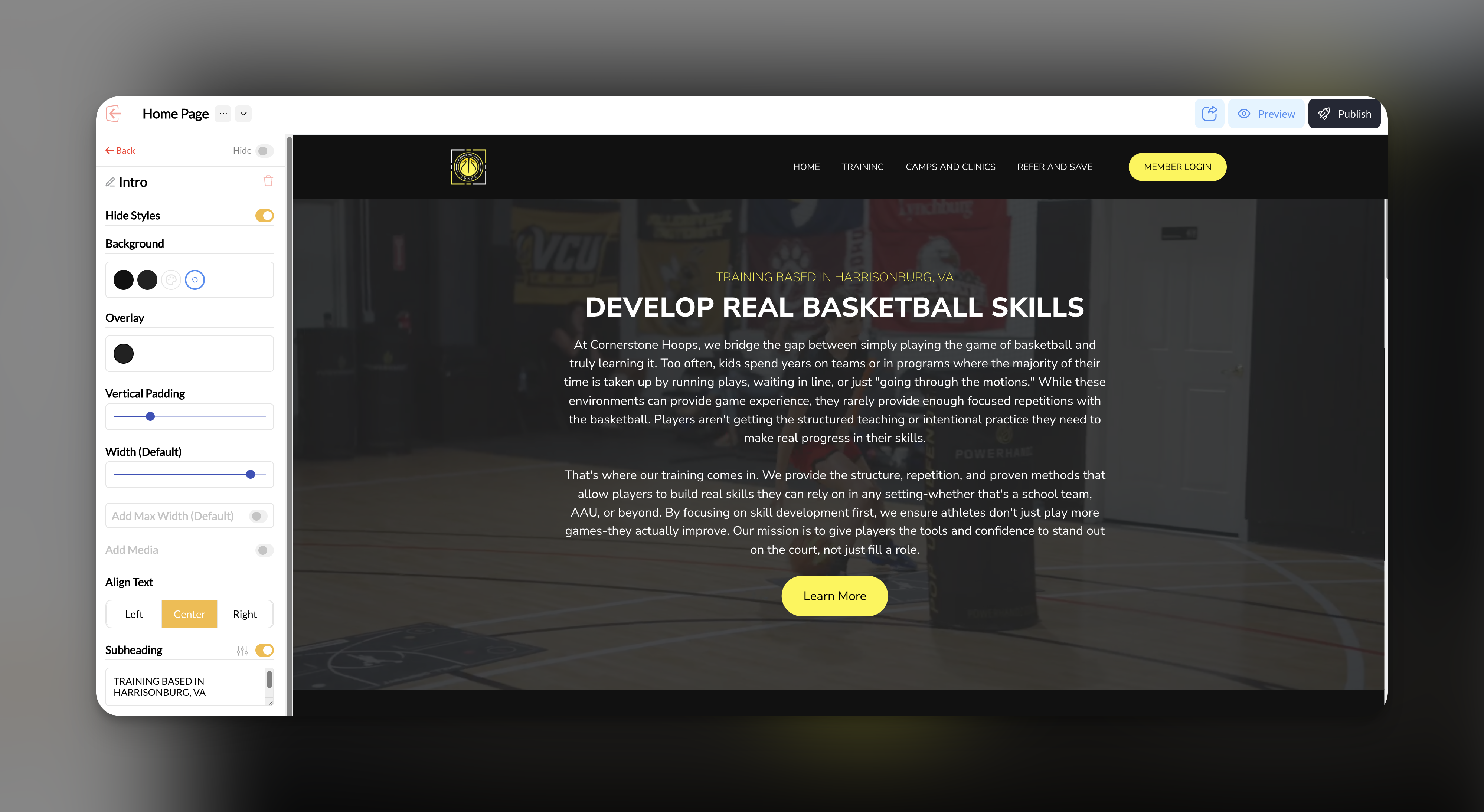
Section background settings
Select the section to style
Click on the section you want to customize in your Website Builder sidebar.
Access background options
In the section settings panel, locate the Background controls under Change Section Styles.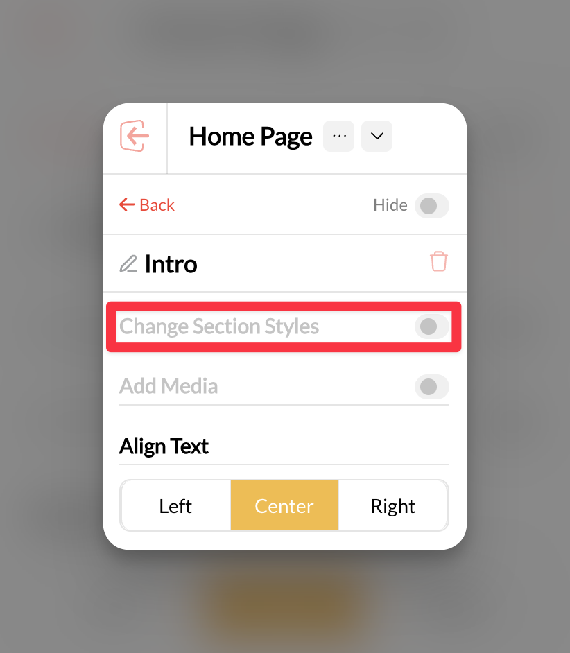
Choose your background type
Select from the available background options: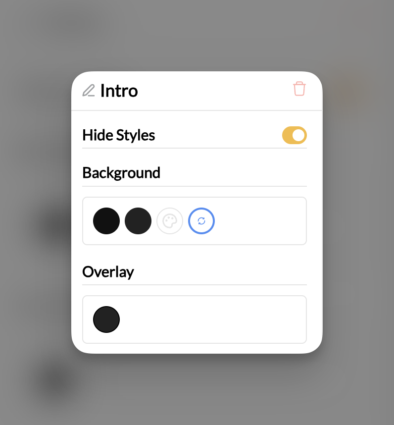
- Solid color: Choose a color that matches your brand
- Background image: Upload an image that supports your content
- No background: Keep the section transparent
Adjusting section spacing
Control how much space your sections take up on the page using the vertical padding controls.Locate the Vertical Padding control
In your selected section’s settings panel under Change Section Styles, find the Vertical Padding slider.
Adjust the spacing
Move the slider to increase or decrease the amount of space above and below your section content.
- Less padding: Creates tighter, more compact sections
- More padding: Provides breathing room and emphasizes content
Vertical padding affects the space inside the section, not the space between sections.
Setting section width
Control how wide your section content appears on the page.Find the Width controls
Look for the Width (Default) setting in your section panel under Change Section Styles.
Choose your width option
Select the width that works best for your content:
- Default width: Standard container width that works for most content
- Custom width: Adjust the slider to make sections wider or narrower
- Full width: Extends content across the entire browser window
Common questions
Why isn't my background image showing up?
Why isn't my background image showing up?
Check that your image file is in a supported format (JPG, PNG, WebP) and isn’t too large. Also ensure the image has been properly uploaded to your media library.
How do I make sections look consistent across my site?
How do I make sections look consistent across my site?
Use the same background colors, similar padding amounts, and consistent width settings across sections of the same type. Create a style guide for your brand colors and stick to it.
Can I use different backgrounds for desktop and mobile?
Can I use different backgrounds for desktop and mobile?
Background settings apply to both desktop and mobile. However, you can preview how backgrounds look on different devices and adjust accordingly.
Pro tips
Related articles
- Adding and Managing Sections - Learn the basics of section management
- Editing Section Content - Customize the text, images, and content within sections
- Buttons and Call-to-Actions - Style buttons within your sections